
The Story Behind My CyberYogi Logo
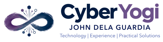
When I started developing the CyberYogi website, I wanted a logo that felt personal.
I didn't want a typical technology logo with a computer, a shield, or a collection of electronic circuits.
I wanted something that represented the name CyberYogi.
That eventually led me to an infinity symbol.
Why an infinity symbol?
I've always been interested in technology, but yoga has also been an important part of my life.
I wanted the logo to reflect both interests.
I liked the flowing shape of an infinity symbol, but I didn't want it to look perfectly geometric.
I preferred something that looked as though it had been painted by hand.
After exploring different designs with AI, I settled on a Japanese-inspired brushstroke infinity.
The softer appearance felt more appropriate for CyberYogi than a conventional technology symbol.
Adding the digital elements
Later, I wanted to introduce something that represented the technological side of the name.
That's where the electronic circuitry came in.
I liked the idea of small circuit traces extending from the infinity, with hexagonal shapes at their ends.
But I wanted those details to remain subtle.
The infinity had to be the main element, with the circuitry becoming part of the design rather than overwhelming it.
I also wanted the circuit traces to fade naturally near the center of the infinity.
Getting that balance right was surprisingly difficult.
Creating an image was the easy part
With AI, I was able to generate a design that looked close to what I had imagined.
The difficult part came afterward.
The image I liked was a raster image, not editable vector artwork.
When we tried reconstructing it, the results kept changing.
Sometimes the infinity looked different. The circuit traces became too long, the hexagonal nodes moved, or the fading effect near the center disappeared.
We went through several revisions.
At one point, I realized we were spending more time correcting the reconstructed logo than developing the rest of the branding.
Eventually, we changed our approach.
Instead of trying to reproduce every detail entirely in vector form, we explored a hybrid design that preserved the original painted appearance while keeping the circuitry and lettering editable.
That worked much better.
More than just a logo
Once we had a design I was satisfied with, we needed to make it usable.
We created horizontal and stacked versions, different color treatments, and separate components.
Even the tiny icon displayed in a browser tab needed attention.
The circuitry looked good at larger sizes, but the details became difficult to distinguish at 16 or 32 pixels. So we used the infinity brushstroke alone for those smaller icons.
Eventually, we completed the CyberYogi Zen Flow Digital branding kit.
I learned quite a bit from the experience.
AI could help me create something, but I still needed to understand what I was asking for, examine the results, and decide whether they were acceptable.
I also learned that sometimes changing the approach works better than continuing to correct the same problem.
Today, the logo is part of the CyberYogi website.
I like how it brings together the two interests behind the name: technology and yoga.
And knowing how much work went into it makes me appreciate the final design a little more.